
Affiliate Disclosure: Some links on this page are affiliate links. If you purchase an item through one of our affiliate links, LXURI may earn a commission at no additional cost to you. Our partnerships may influence which products or brands we feature, but they do not determine our editorial opinions or recommendations.
Discover a Warmer Way To Live
The fall interior design color trends for 2026 favour rooms with softer contrasts and richer tones. Cream and mushroom take the edge off stark white. Meanwhile, chocolate brown, caramel and cognac bring warmth to spaces that once leaned heavily on cool grey.
The brighter notes are just as useful. Olive and moss can ground a room, while mustard, burgundy and blue-green teal give it a point of focus. Start with one shade you already love. Then repeat it somewhere small before deciding whether to give it more space.
Explore our partners, Jonathan Adler, POVISION, Acanva, Homary, and Mytheresa, and discover a warmer way to live.
- Fall Interior Design Color Trends at a Glance
- Warm Neutrals: Layer Cream, Mushroom and Chocolate
- Green as a Neutral: Give Olive, Moss and Sage More Space
- Rich Accents: Burgundy, Mustard and Transformative Teal
- DISCOVER TWOPAGES CUSTOM CURTAINS
- Use Upholstery and Drapery to Change the Mood
- How to Make Fall Interior Design Color Trends Work Year-Round
- Related Resources
Fall Interior Design Color Trends at a Glance
| Colour Direction | Shades to Try | Where to Start | What to Pair With It |
|---|---|---|---|
| Warm neutrals | Cream, mushroom, taupe and chocolate | Sofa, drapery or walls | Walnut, olive or warm brass |
| Golden warmth | Cognac, caramel, bronze and mustard | Upholstery, a cushion or a throw | Cream, cocoa or deep green |
| Green as a neutral | Olive, moss and muted sage | Reading chair, lower cabinets or a shade | Oak, limestone and warm white |
| Wine tones | Burgundy and oxblood | Tray, small box or velvet curtain | Taupe, pink-beige or chocolate |
| Blue-green accents | Petrol, deep teal and muted aqua | Swivel chair, cabinet or glassware | Cognac, ivory and aged brass |
Fall Interior Design Color Trends
Fall 2026 gives neutrals more depth and jewel tones more room to play. Explore designer home décor at Mytheresa LIFE and discover how to bring the season’s palette home, one piece at a time.
Warm Neutrals: Layer Cream, Mushroom and Chocolate
Warm neutrals are the easiest fall interior design color trends to live with year-round. Try creamy off-white on the largest surface and mushroom or taupe where you want gentle contrast. Then use chocolate brown in a few distinct places so the room has depth.
You can keep a cool grey sofa if it still works for you. For example, a taupe rug, cream curtain and brown velvet cushion can bridge the old palette and the new one. Compare those tones next to the sofa before buying. A cream with a strong yellow cast can make blue-grey upholstery look colder.
Choose a Cream Sofa That Suits the Room
Acanva’s Mellow Sectional in Velvet Cream is a soft, light anchor for a large seating area. Pair it with a dark wood table so the seating has a clear outline. Before ordering, confirm the right-hand layout against your floor plan.
Meanwhile, the Acanva Mareta Modular Reversible Sectional in Chenille Cream offers a textured take on the same colour story. Consider the two-piece set if you want a quieter backdrop for patterned cushions. Compare the fabric samples in your room: velvet can look lighter or darker as the pile catches the light.
POVISION’s French Retro Cream Electric Retractable Sofa brings the pale palette into a room that doubles as a place to lounge or host guests. Keep the rug and side tables clear of its path. In addition, check the full extended footprint before you plan the rest of the furniture.
Use Cognac and Bronze to Give Cream Some Depth
Jonathan Adler’s Sunset Sofa in Venice Cognac brings a caramel tone to the largest piece in the room. Pair it with mushroom walls and an off-white rug for a soft contrast. Then add a small olive accent to keep the palette from reading too orange.
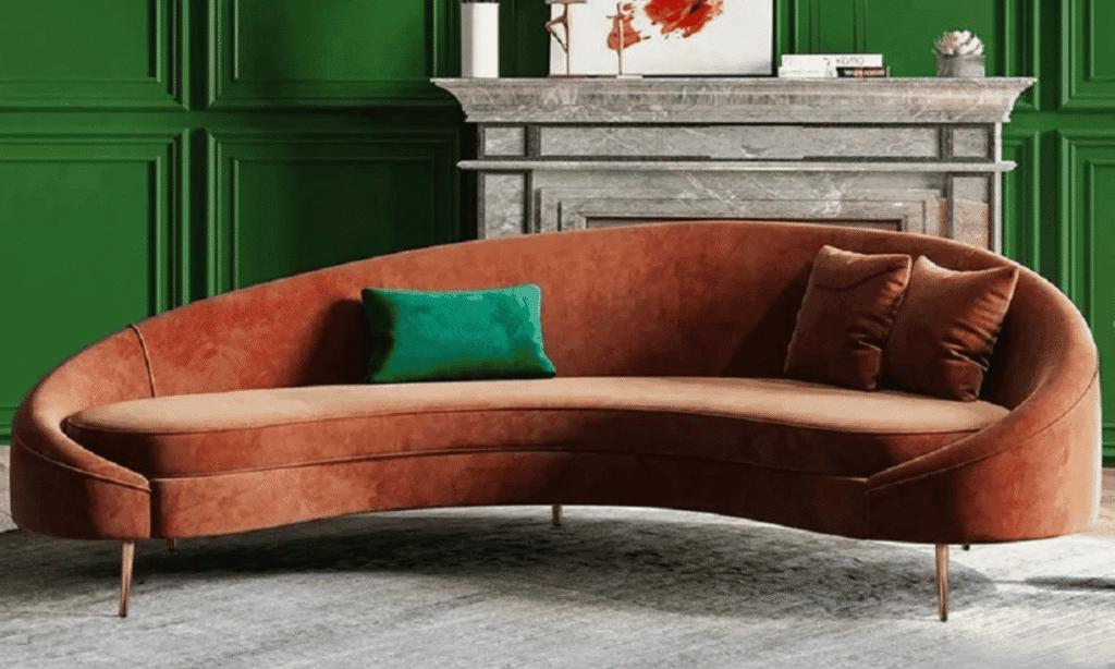
Homary’s Modern Velvet Curved Sofa in Bronze gives the same idea a more formal look. Its curved shape works well with a round coffee table. Meanwhile, its gold-tone legs can pick up the warmth of a lamp or picture frame without requiring a full set of matching metals.
Add Brown Through Objects You Can Move
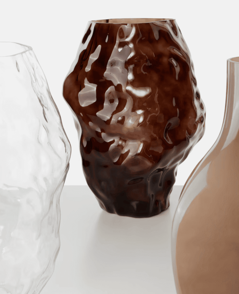
On Mytheresa LIFE, the Serax Dunk Vase by Bob Verhelst brings brown to a shelf or dining table. The 101 Copenhagen Katachi Big Glass Vase by Kristian Sofus Hansen and Tommy Hyldahl gives the colour a different look through glass. Choose one based on the surface: a dark brown object stands out on pale stone, while glass can catch the light near a window.
For smaller touches, set the Michael Verheyden Brown Suede Box on a desk or dresser. Meanwhile, a Milena Kling Medium Brown Glass Decorative Object works well on a stack of books. Finish with the Once Milano Brown Velvet Cushion if your cream sofa needs more contrast at eye level.
Green as a Neutral: Give Olive, Moss and Sage More Space
Among the fall interior design color trends, muted green makes a good base because it sits easily beside wood, stone and cream. Sage feels airy in a sunny room. Meanwhile, moss and olive add more depth beside darker oak or walnut.
In a kitchen, try olive on an island or lower cabinets, with warm white above. If you’re keeping the cabinets, introduce green through a Roman shade or glassware instead. Either way, hold your samples next to the countertop, since the stone’s undertone can change how green reads.
Let One Green Seat Set the Palette
Jonathan Adler’s Buenos Aires Lounge Chair in Highland Olive makes a natural starting point for a reading nook. Give it a cream rug and a dark side table. Then repeat the olive in a cushion across the room.
Acanva’s Beryl Lounge Chair in Linen-Like Castleton Green gives green a more prominent role. Pair it with the Mareta in Chenille Cream for a clear light-to-dark contrast. If you want green to carry the whole seating area, try Homary’s Axial Green Bouclé Fluted Three-Seater Sofa against a warm off-white wall. The fluting adds enough detail that the nearby fabrics can stay plain.
Repeat Green at a Smaller Scale
Jonathan Adler’s Casa de Campo Pillow in Olive can tie a pale sofa to an olive chair across the room. For more contrast, try the Pompidou Olive Plus Pillow, which pairs olive linen with a vivid pink motif. Use it where that touch of pink can stand on its own.
On Mytheresa LIFE, the NasonMoretti Borealis Green Glass Bottle and Tumblers Set brings colour to a dining table without changing the furniture. Meanwhile, the Venini Clessidra Sommersa Murano Glass Hourglass in Green works as a single focal point on a shelf. A Trudon Ernesto Classic Candle in Green or Giobagnara Nodo Leather Doorstop in Green can carry the same colour into an entryway.
Rich Accents: Burgundy, Mustard and Transformative Teal
The more expressive fall interior design color trends work best when each accent has a clear role. Burgundy adds depth. Mustard brings a golden note. Meanwhile, teal gives warm browns and creams a cool counterpoint.
Burgundy: Start With One Surface
Set the 101 Copenhagen Bloom Large Burgundy Ceramic Decorative Tray on a light oak coffee table. Its broad shape lets the colour register without adding several small objects. For a subtler detail, use the Michael Verheyden Burgundy Suede Box on a cream console or bedside table.
If you want burgundy to play a bigger role, try a wine-toned velvet drape. First, hold a swatch against your wall in daylight and after dark. A shade that looks red by the window may read closer to plum under a lamp.
Mustard: Add Light Without Reaching for Bright Yellow
Look for ochre or mustard when you want yellow to sit comfortably beside olive and brown. The Les Ottomans Yellow Silk Velvet Cushion offers a brighter take on the idea. Try one on a chocolate chair, then keep the rest of the seat plain.
For more pattern, drape the Missoni Ziggy Wool and Cashmere Throw over a cream sofa. Let its multicoloured design guide your next choice. For example, pull just one shade from the throw into a nearby cushion or vase.
Teal: Balance Blue-Green With Warm Materials
WGSN and Coloro named Transformative Teal their 2026 Colour of the Year. In a room, the broader blue-green family offers several ways to use that idea. A petrol upholstery can feel subdued, while deep teal lacquer makes more of a statement.
Jonathan Adler’s Sebastian Swivel Chair in Harris Petrol is a good choice when you want blue-green on a single seat. Pair it with a cognac sofa and cream curtains. Meanwhile, the Kiki Cabinet in Deep Teal Lacquer brings a glossier finish to a dining room or entryway. Choose either the cabinet or the chair as your main teal piece if the room already has a strong pattern.
DISCOVER TWOPAGES CUSTOM CURTAINS
Bring fall’s warmer palette to your windows with custom curtains by TWOPAGES. Consider velvet in a rich earthy shade for depth, or choose a lighter fabric to soften the room while keeping it airy. Before ordering, compare swatches beside your walls and upholstery, then select the dimensions, heading style and lining to suit your space and light-control needs.
Use Upholstery and Drapery to Change the Mood
Set Up a Reading Corner or Media Room
POVISION’s Vintage Chenille Loveseat offers an extra-deep seat for relaxed lounging. Pair it with a floor lamp and a brown velvet cushion, then check the seat depth if you prefer to sit upright. The POVISION Modern Minimalist Sofa With Lumbar Support is another option to compare if back support matters to you. Choose the upholstery from a sample before assigning it a role in the palette.
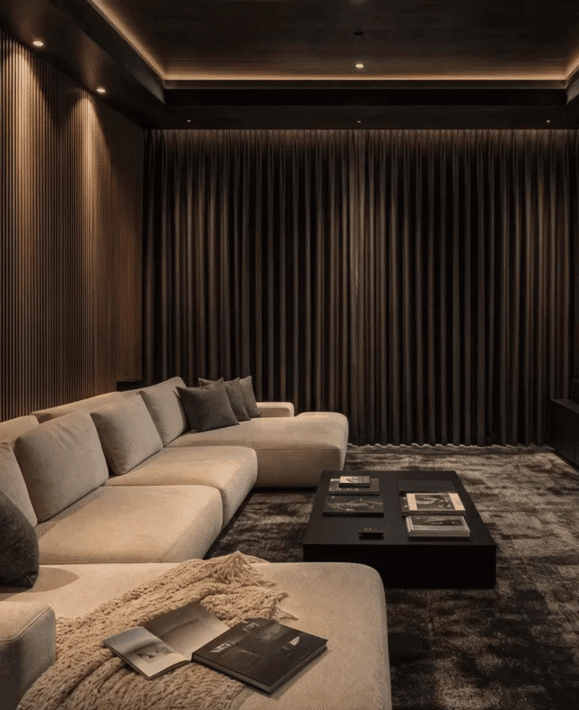
A POVISION Fabric Power Recliner can make sense in a media room where you want an adjustable seat. Check the outlet position and the space it needs to open. Meanwhile, keep the colours simple with a warm neutral rug and one wine or olive accent.
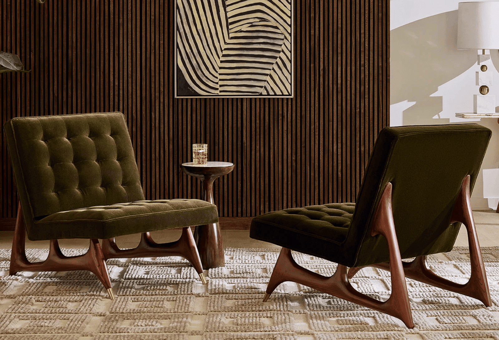
For a conversation area, try Homary’s Velvet Fluted Accent Chairs with Wood Frames as a pair. Their texture can carry the look even if you choose a quiet colour. Alternatively, Homary’s Swivel Bouclé Barrel Accent Chair can serve both a window and a sofa. Leave enough space around it to turn freely.
Choose Custom Curtains for the Light You Want
TWOPAGES’ Birkin Velvet Curtain is a way to make a plain room feel warmer without changing the sofa. Sample a cocoa, olive or wine tone if offered, and view it vertically. Meanwhile, compare the Birkin Velvet Blackout Theater Curtain for a media room or bedroom where light control matters. Check the coverage at the edges as well as the fabric.
If velvet feels too heavy, consider the TWOPAGES Sara Le Print Linen Drapery With Grommets. It adds pattern to a room with plain upholstery. For a smaller opening, the Jawara Cordless Linen Cotton Roman Shade gives you a more compact treatment. Match its undertone to the walls or woodwork, and confirm your measurements and lining before ordering.
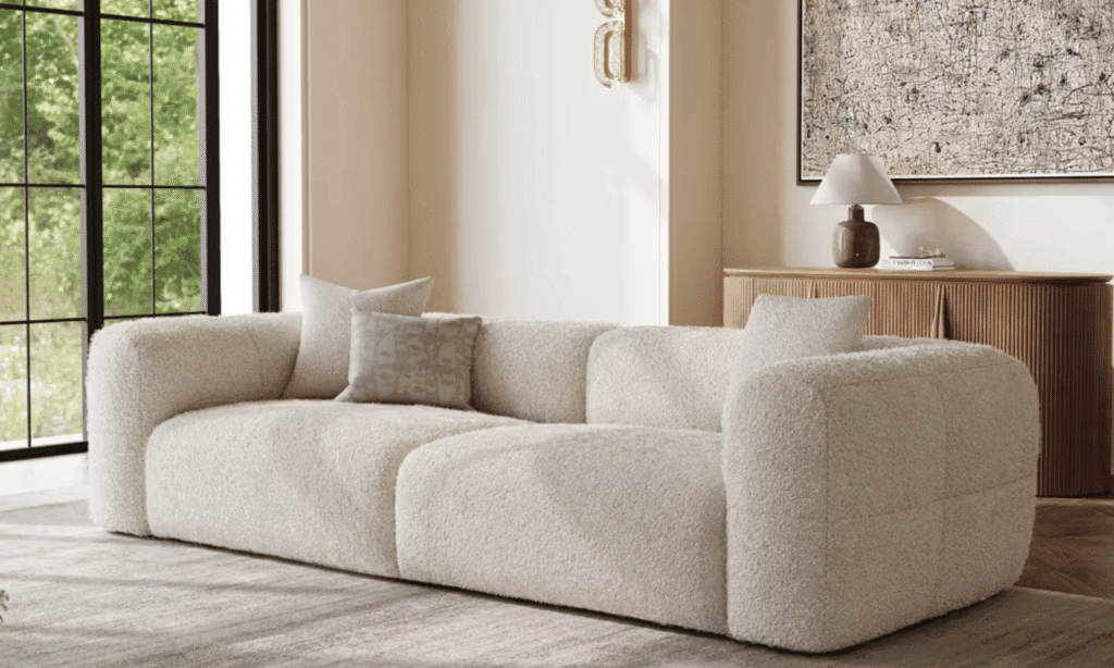
How to Make Fall Interior Design Color Trends Work Year-Round
Start with the piece you expect to keep longest. If that’s a cream sofa, use it as the base for olive, chocolate or burgundy. If it’s a cognac sofa, bring in a lighter neutral and try petrol blue on a chair or an object.
Next, check samples in the morning and again under the lamps you use at night. Compare them with the floor and the largest piece of furniture. Finally, repeat one accent in two places so the eye can move through the room.
The most useful fall interior design color trends give you a way to work with what you own. Keep the pieces you love, add warmth where the room feels cool and let one strong colour do most of the work.
Related Resources
- Fall for Your Home With Designer Home Décor
- Ultimate Dining Room Interior Design Tips
- Wedding Gift Guide for Interior Design Lovers
- 10 Bedroom Interior Design Trends for 2026
- Design the Ultimate Basement Home Theatre
- Read More Interior Design Articles by LXURI
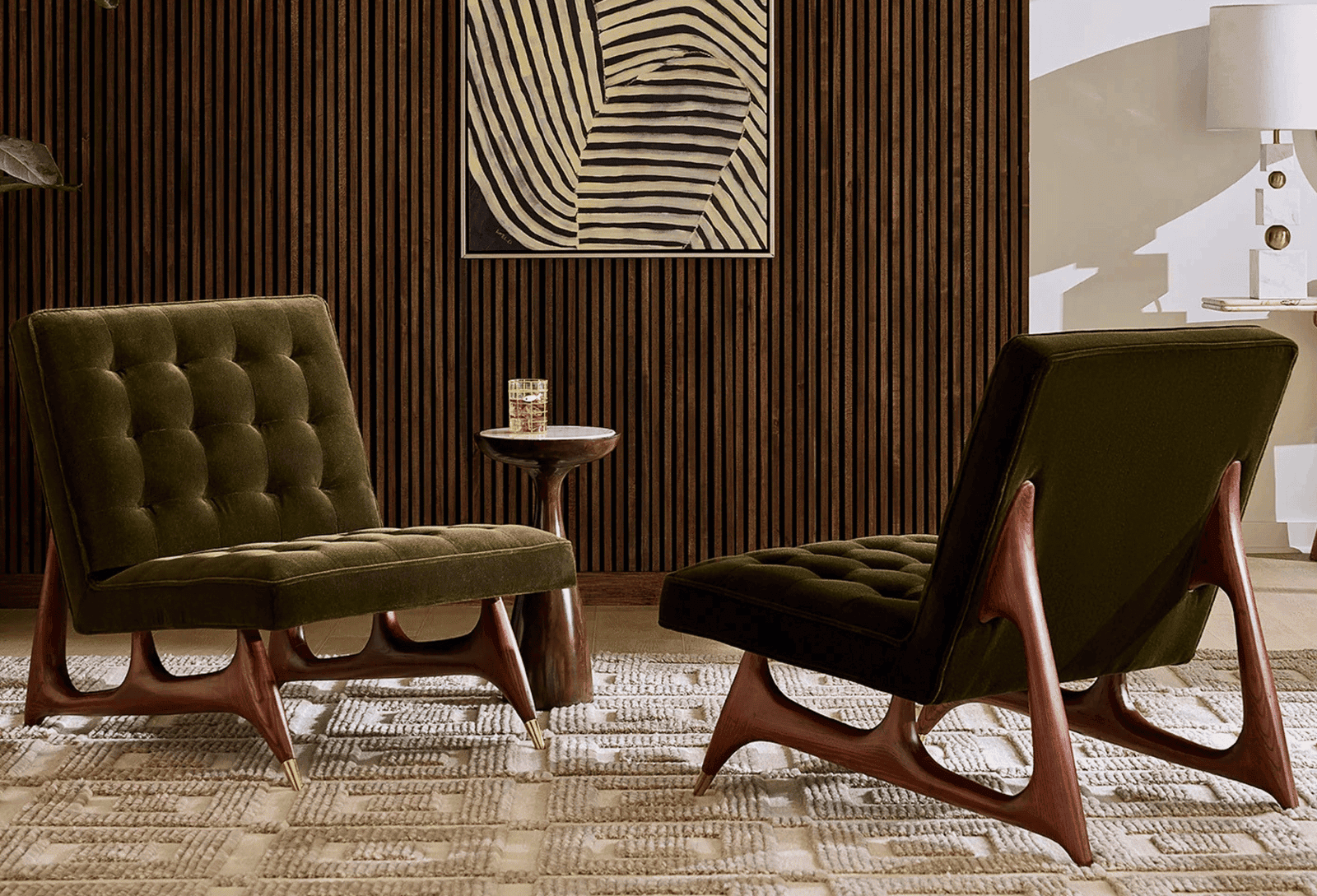
Fall Interior Design Color Trends for 2026
Fall 2026 gives neutrals more depth and jewel tones more room to play. From a cream sectional and an[…]
How to Choose Luggage for International Travel
The right suitcase depends on your flights, what you pack and how you get around once you land. Compare[…]
Discover How to Select Lighting for Every Room
Beautiful lighting starts with understanding how you use a space. This room-by-room guide explains how to compare fixtures, choose[…]
Resort vs. Boutique Hotel: Which Is Right for Your Trip?
Should your hotel be the destination or your base for exploring? Compare luxury resorts and boutique hotels, understand the[…]
Cashmere Buying Guide: How to Evaluate Quality
What makes cashmere worth the investment? Learn how to assess fibres, construction, fit and care requirements, then explore Pura[…]
Italian Glamour: The Etro Holiday Capsule at Mytheresa
Explore the Etro Holiday Capsule at Mytheresa, where signature paisley prints meet plush velvet and expressive eveningwear. Discover how[…]